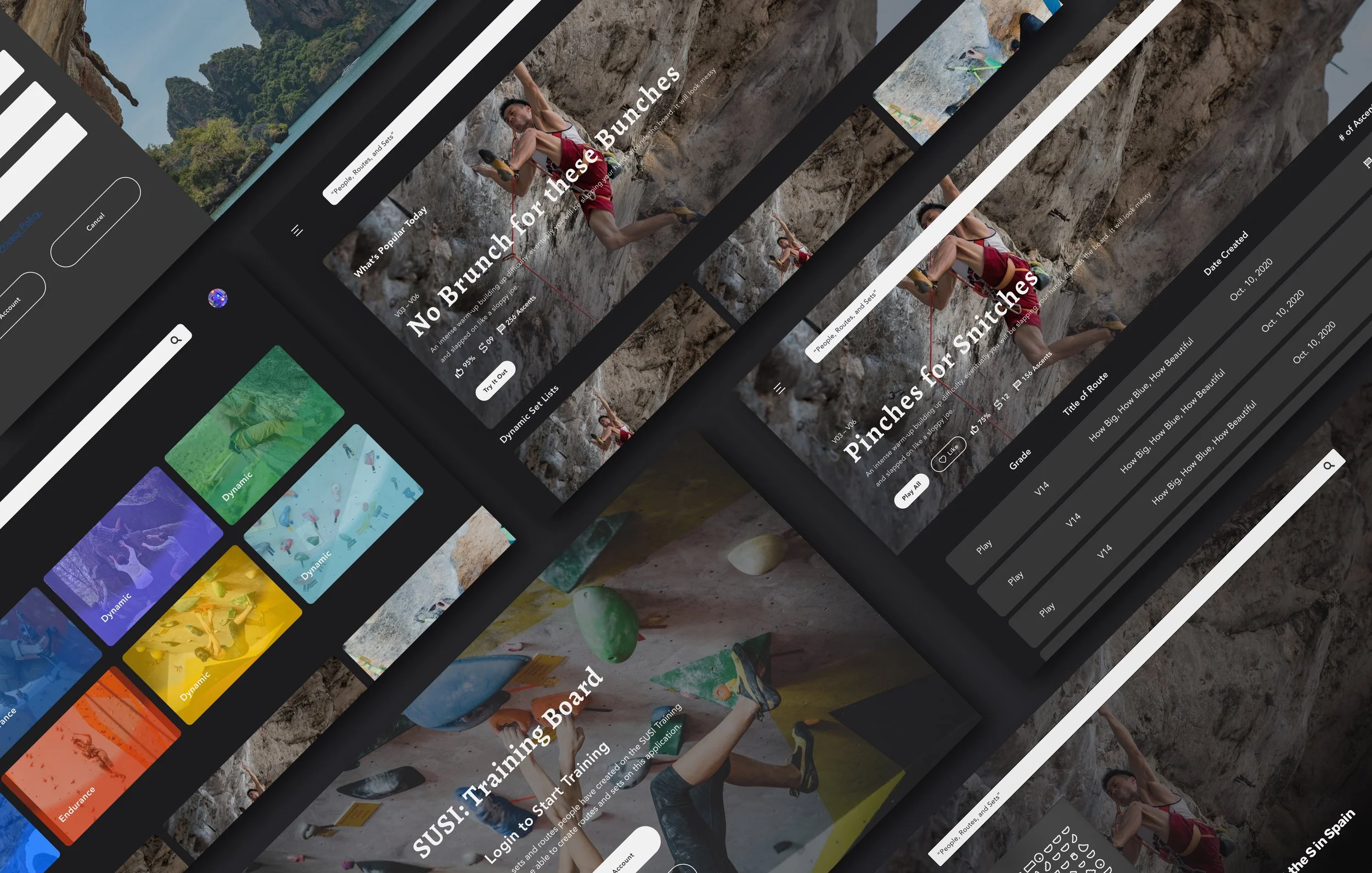
SISU : An Apple TV for Climb Training
Skills
UX/UI, Product Design and Case Study
Type of Project
Passion Project (In-Progress)
Prompt
Design an interactive system to solve for a wellness routine, involving a TV screen and remote app design
Personal Motivation
As someone who adores rock climbing, this inspired me to want to continue wanting to work on this project and as well as climb harder. This reminded me of my drive for wanting to pursue design. It was deeply motivated by people, especially those in such small communities with unique interests. Everyone I’ve met in the climbing community were always so welcoming, their tenacity and laid-back nature… it was inspiring and great learning about them.
The Design Process
The Problem
At the start of the project, I ran a few interviews before concluding to focusing on the training board. I’ve noticed a few notable challenges: they’d spend countless time searching for a route more than actually climbing, the applications look very outdated and beginner climbers are intimidated to use the training board.
Initial Questions
How do I design the application to better support their focus on training?
How do I design the starting experience to be less confusing and intimidating on the training tool?
What are the opportunities to modernize the training tool?
The Proposed Solutions
People are a little difficult to know without an introduction, that’s only natural. Thus it is something I’ve noticed from playing around with the tool… there is a lack of introduction. I believe if there is an on-boarding process, it would bring in more climbers to come enjoy another option to climb.
Finding routes can take a bit of time because they would mentally filter needs to better find what is near or exactly what they are looking for. I believe if there is an option to find specific hold(s) or movement(s) to work on, they’d be able to climb more focused-ly.
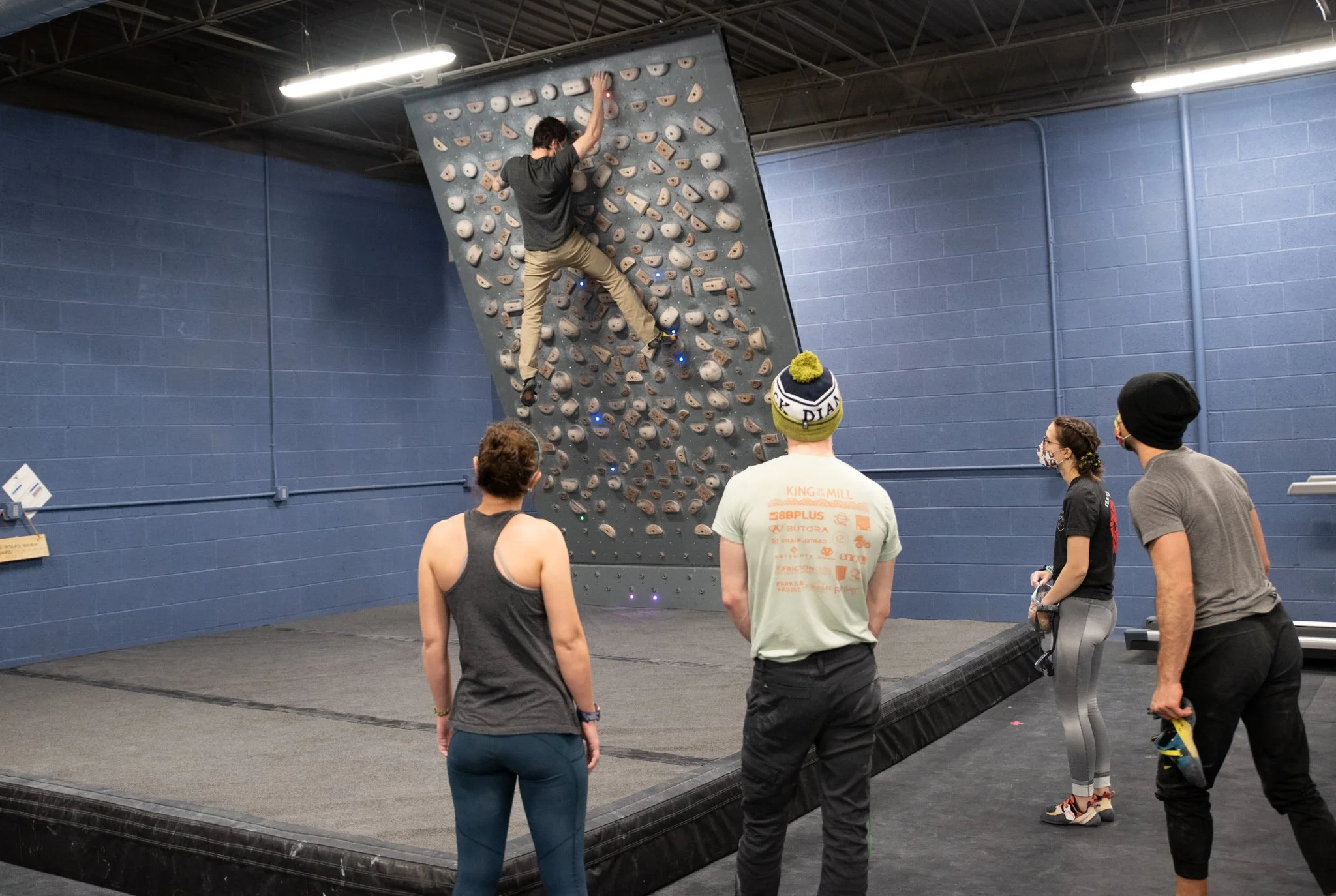
Photo Credit: RockMillClimbing
👈🏽 I want to clarify this before we go any farther— this is a training board.
The way this training wall works, it’s a board with lights and the holds are made of wood. The intention of having a wooden holds is to take better care of their hands and not have as much skin tears. The board is also shorter than a usual bouldering wall but it’s meant to work on power, and dynamic (big) movements.
The light system, the climber starts at the green light, uses their hand and feet for the blue but the purple is strictly for feet and the red light are the ending holds. There is an application via phone by the name of whatever company it’s from (in this case, its Tension Board). The application shows the different routes of varying levels of difficulty.
Research
Conducted 6 interviews, from Instagram and the local gym. Concluded information by things said and observations.
I wanted to better understand why the different climbers use the tension board.
Practice specific movements
Build strength for outdoor climbing
Switching up their climbing routine from the usual bouldering wall
There were also some observational things I’ve come to notice:
Climbers felt like they were wasting time just continuously searching
(Beginners) Do not feel confident they know what they are doing
(Beginners) felt kinda lost what to pick out for climbing
Defining the User Profiles
After conducting the interviews, I went through their responses and my observations. I defined the different users and chose the ones that best encompassed the struggles of my users.
The Dedicated Climber
As a dedicated climber “I want to climb routes that are increasingly difficult and similar to my style to develop my technique.” So that I can improve and become a stronger climber.

Photo by roya ann miller on Unsplash
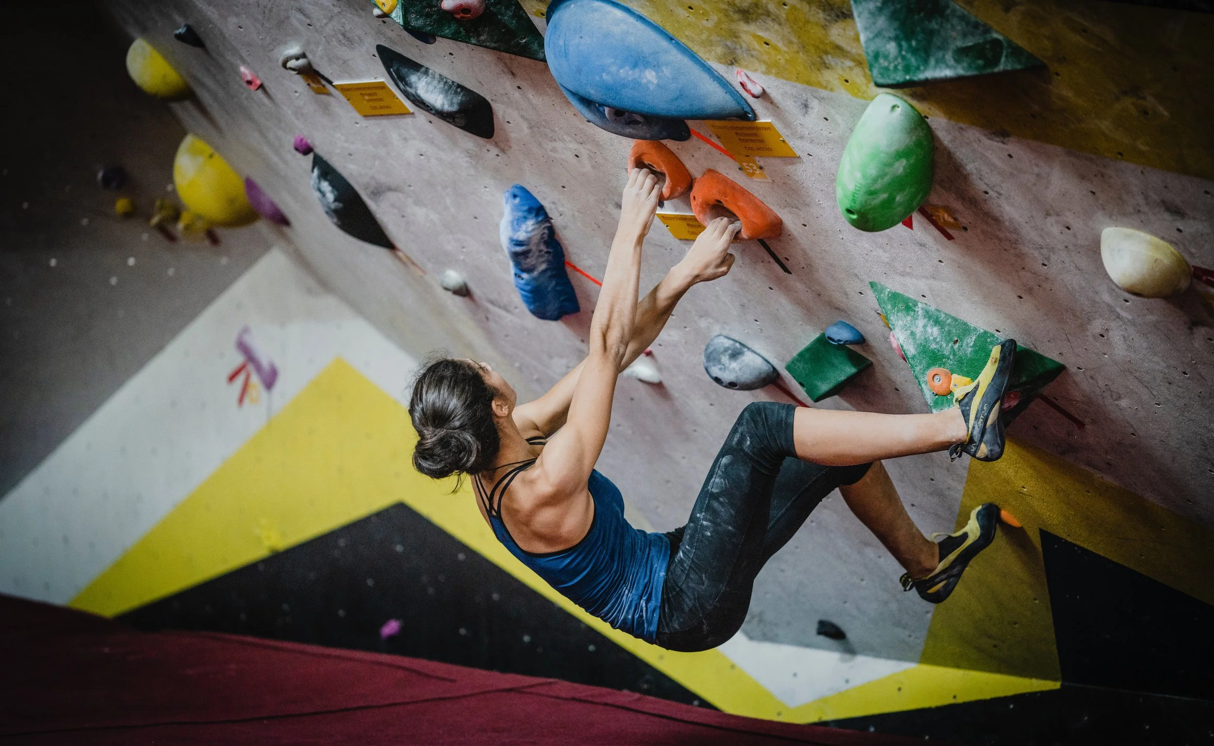
The Social Climber
As a social climber, “I want to climb fun routes with other climbers to talk about the projects and routes.” So that I can have fun and enjoy the sport and have some good laughs during the session.
Goals
User Flows + Information Architecture + Wireframes
After defining the goals for this project, I created user flows and super low-fidelity wireframes. This is so create an image and idea if these are actually accomplishing anything.
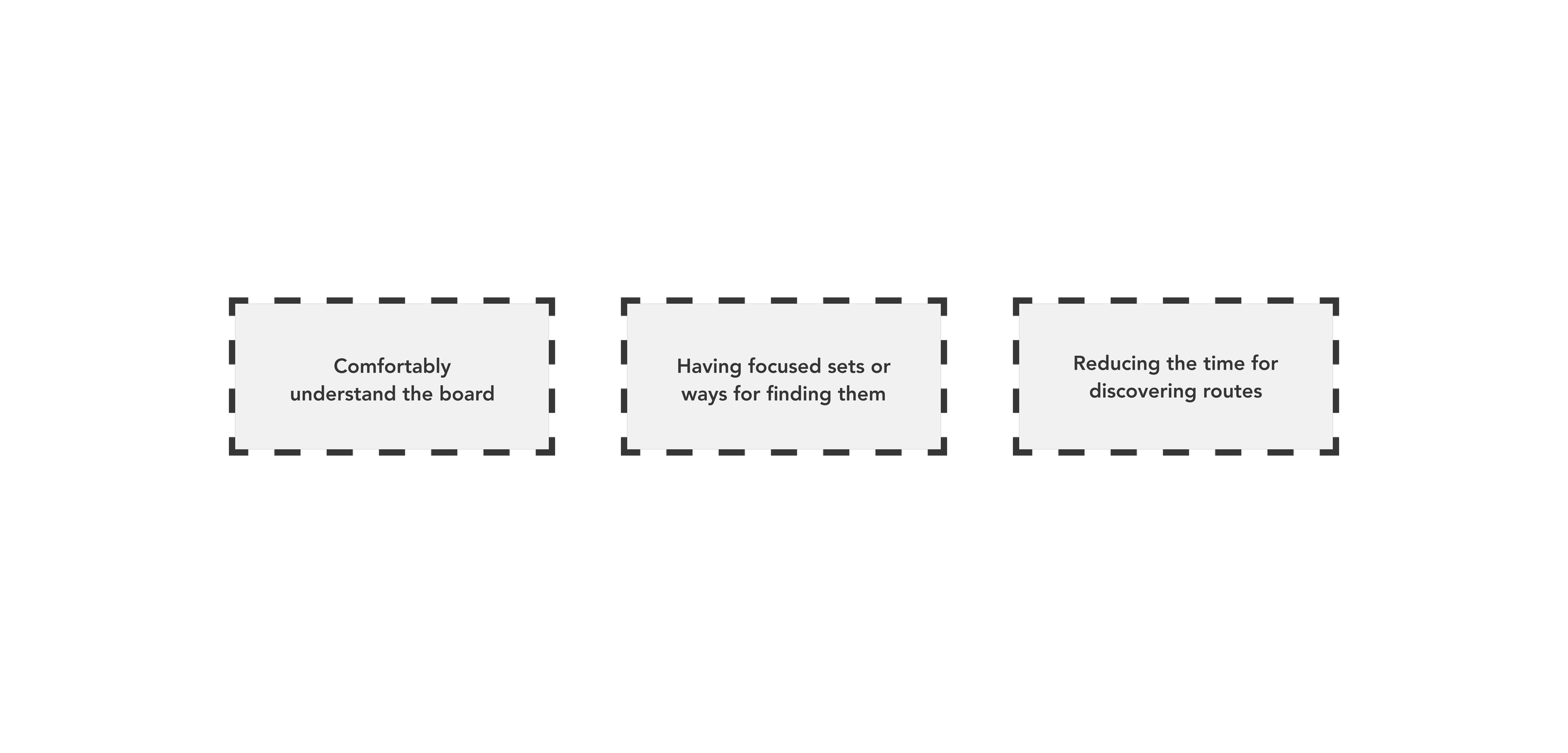
Goal 1 : Reducing the time for discovering routes
Goal 2 : Having focused sets or ways for finding them
Goal 3 : Comfortably Understand the Board
Mood board & Design Inspiration
This should evoke the sense of competition. Bright colors that feel powerful, energetic, and hyped. I wanted to match the feeling of training, you would want to feel like a beast and you’re training to become beastly at climbing.
User Interface Inspirations
I took a lot of inspiration from different outdoor based companies and especially from Spotify (shamelessly). Spotify’s organization for playlists and discovery seem to fit what exactly I wanted and I took a lot of similar approaches to them. However, the reason for taking a lot of inspiration from outdoor companies is to maintain a modern feel of what they are doing currently.
My Final Solution
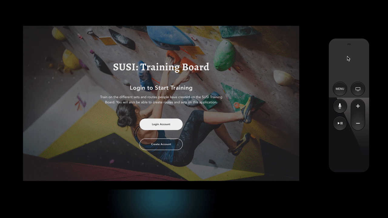
On-Boarding Experience
This is to introduce beginner climbs on this tool and how to use it. However, I wanted to keep it brief, the beginners just want to climb it and try the offerings on this application. Thus, I just show the information of this application.
Categorized Curated Set Lists
I wanted to keep this pretty similar to lot of the streaming services available. This would feel a lot like similar to what is out there; Netflix, Spotify Apple TV, and YouTube.
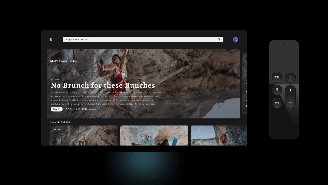
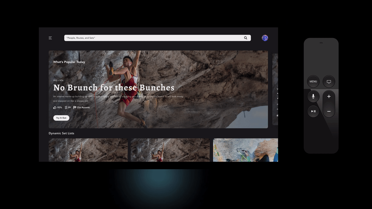
Discovering New Curated Routes
The ability to find various climbs, specifically set-lists, is important. Thus, going through the discovery tab in the application allows the person to discover more sets or even routes.
Key Take Aways
• Using Inspiration from the industry. For a long time, I really struggled with understanding how to look at inspirations and what other companies. During the project, some odd reason the whole thing clicked on how I am able to move with these new ideas. This definitely changed the way I looked at the climbing and outdoors related products cause some of them presented more “go-getter” or “die hard” energy.
• Progressing forward with mistakes from research. Often times during the interviews, I had to approach people through Instagram. While some of them weren’t entirely open to the idea of face-cam calling. So they answered through text message, which was fine but it was a lot more difficult to target and ask genuine questions. Other times, I noticed I would start using leading questions and it affected the response but I corrected myself before the other participant.
• Take more risk for the sake of studying and exploring. When I was learning and ideating, I noticed that I would be reluctant to express where my ideas are coming from. Due to the lack of expression, it only made me forget where the roots came from and not explored enough I feel like.
When I finished this project for class, I am proud for pushing myself to the end and being consistent with it. However, I was not too happy about it so I took a break after the semester ended and pursued cleaning up the concept to better suit my vision. Also another thing, I didn’t like how I started to add random out-scope items when the deadline was approaching. I feel like it would’ve been better use of time to polish the main concept, and getting feedback.