Overview
The Connections onboarding redesign addressed critical user retention where 80% of new users abandoned the sobriety support app after first login. The goal was to guide patients from registration to an active community through interactive walkthroughs and as well as add the app's first motion designs along with implementing a new visual design language.
Skills
Figma
LottieFiles
FigJam
Role
Product designer
Interaction designer
Visual designer
Platform
iOS
Android

The Problems
Through stakeholder alignment sessions, they’ve identified three core issue that contributes to user abandonment:
1. Unclear purpose of the app
There is no informational section that shows people what makes Connections' useful. E.g. There is not indicator that shows there is a strong supportive community.
2. Visually outdated and cluttered
Lack of visual engagement all the way from registration process to the actual application. It did not look professional nor cohesive. Rather with it’s cluttered appearance, it made Connections somewhat vague and overwhelming.
3. Limited awareness of services
Continuing with the cluttered appearance, there was no guidance to show what features patients have. They were unaware of the different type of surveys, and group messaging we have in Connections’
Design Opportunity
"How might we connect new individuals with our supportive community, proven tools and dedicated staff?"
Our goals for the project
During the alignment meetings, they’ve came to a few solutions on what they want:
1. Present the tools & features
An on boarding process that presents information for the patients. This would give patients a wider perspective of Connections than an app for "sobriety.”
2. Add testimonials
Show personal comments made from those in the community. It would allow the patients to reasonate and see how Connections’ is useful.
3. Brighten up the visual designs
The design and layout is very much dated. There wasn’t consistency nor use of micro interactions to provide more engagement.
Design Iterations
We went through a lot of design iterations due to stakeholders pivoting. However, eventually we came to a decision. I did try to point them towards a direction where the onboarding does not become exceedingly long. However, they prioritize their own input and understanding of what they want.
Iteration #1
I created this flow for when the individuals are going through the preboarding, after creating their account.
I used some inspiration from other applications, where people would create their account and then walked through.
Iteration #2
Similar approach to the iteration prior. Instead I included the testimonials after creating their account and inside the application instead.
Iteration #3
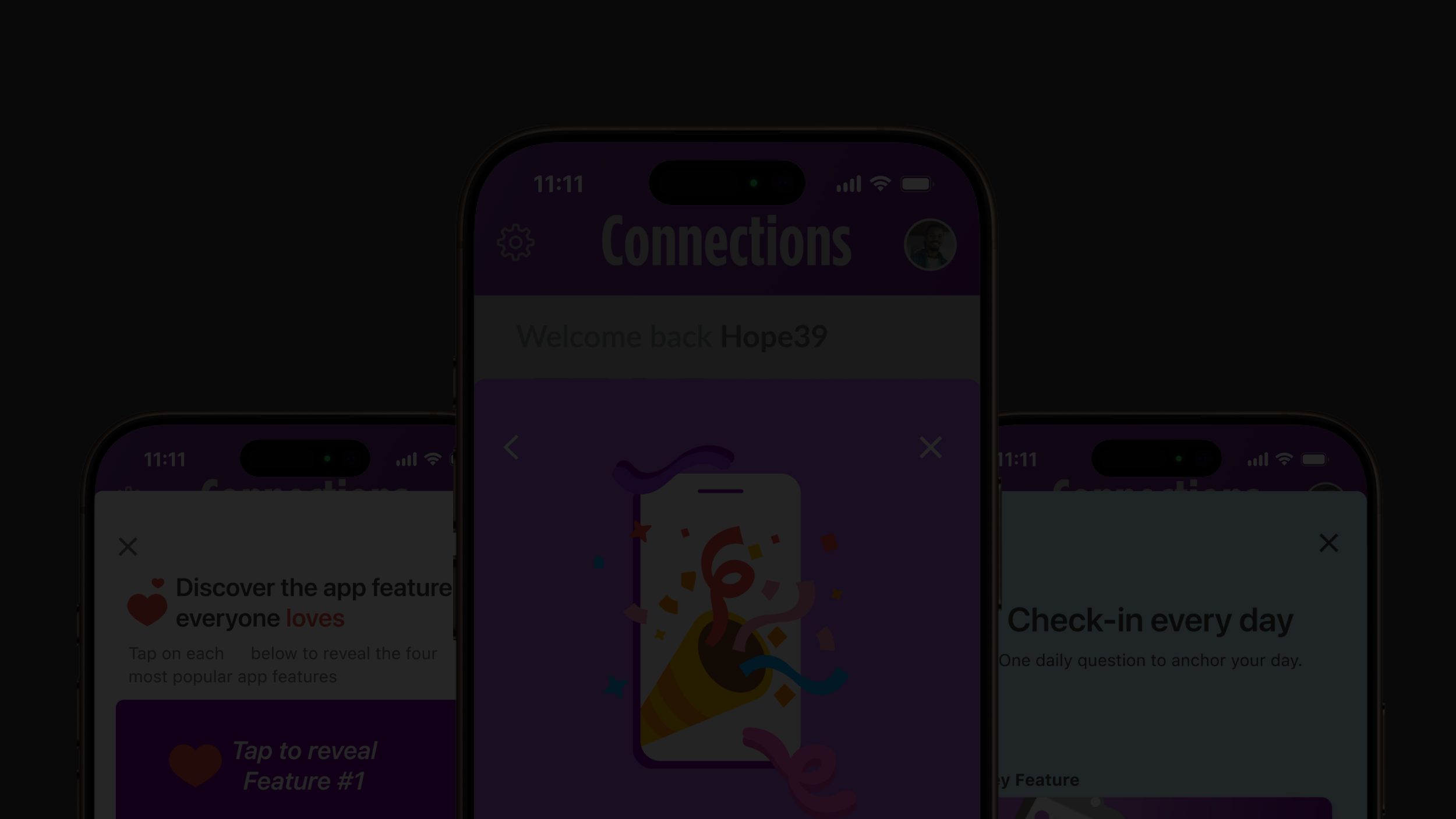
I created this iteration, where the designs show literally what is in the application. Then at the very end, include an already existing screen where it gives the new coming patients a direction to go.
Stakeholder Feedback
During the meeting for feedback, they’ve felt like the designs I’ve created were not exactly what they envisioned. Later I learned, they’ve been changing their minds as I was designing. Which later we discussed and came to a few new goals on what they want:
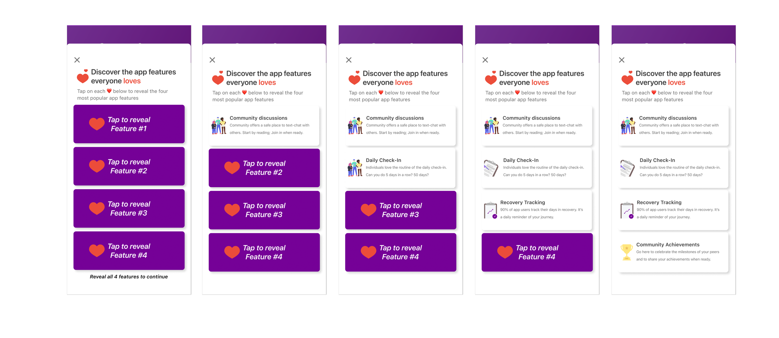
1. Literal reveal actions
They mention about how they want some of the information to be click to reveal. To drive user interaction and interest in the application.
2. More excitement
With the thought of driving more engagement, they want more playful illustrations
3. Longer boarding process
I wasn’t expecting them to want an extra long onboarding. They wanted the onboarding to make the patients see all of the benefits.
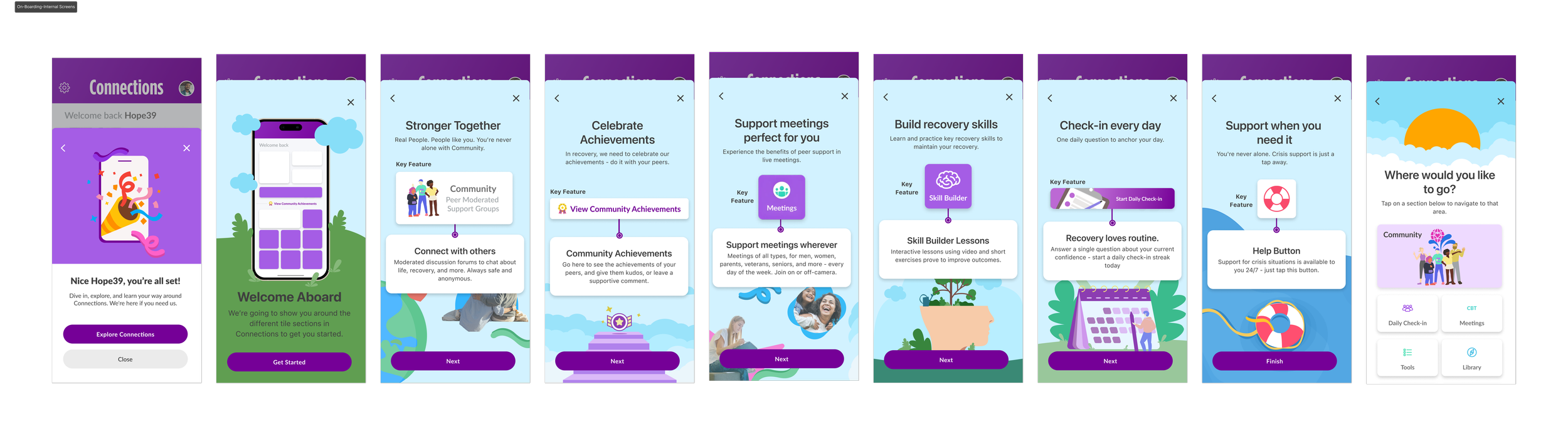
Finalized Designs
The finalized iterations were a cultivation of everything stakeholders envisioned; more illustrations, a view of testimonials, and the wide variety of features in Connecitons’. The stakeholders’ goals for the onboarding process was to be more exciting and engaging while being informative.
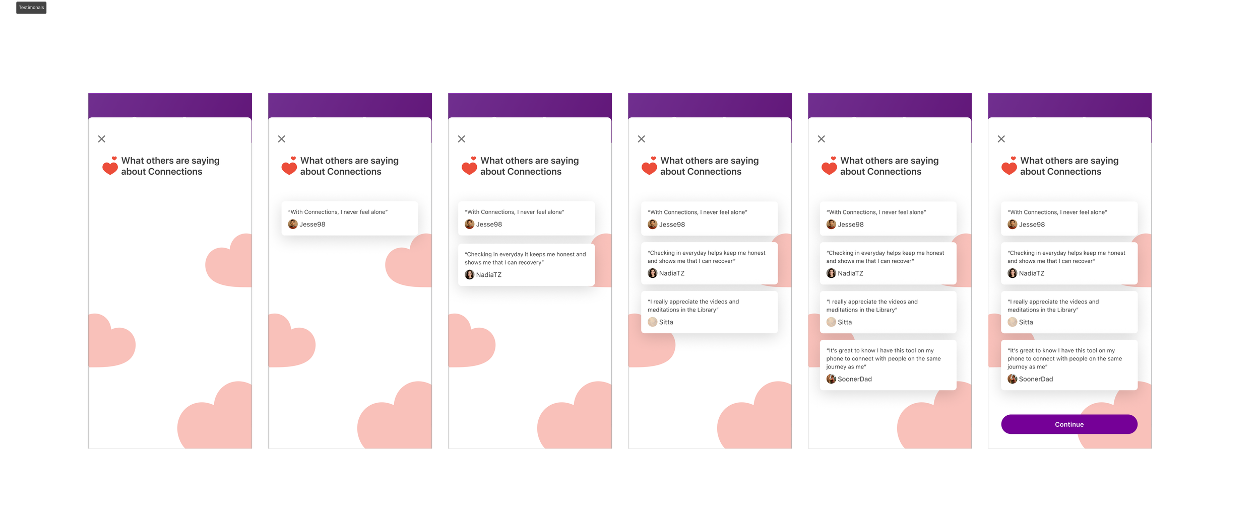
Testimonials from current patients
The stakeholders wanted to show these testimonials to the patients to build trust with newer patients.
Reveal Features
As stated before during feedback, they wanted the patients to be engaged with the onboarding process. These screens include reveal features so patients could consistently interact while also learning about the app.
Outcome & Reflections
These designs did teach the patients about the usefulness of the Connections. However, they learned that the real reason people don’t complete the onboarding is due to not feeling like it’s the right time of their journey. Also that the request for a lengthier onboarding made no difference on how much people continued to onboard. Eventually, they removed the testimonials, and reveal action screens. Leaving only the in-app screens showcasing features of Connections.
What I learned:
Separating my own feelings from what the business wants. It’s not always going to be about what I want to do.
I’ve learned tremendously on communicating animations with the dev team. This was my first time creating animated illustrations (used LottieFiles).
What I’d different:
Stronger advocacy for more user research. Only did research with the people who actively engage with the patients. (Company is super opposed to the designer doing the research). This would’ve saved so much time for me deciphering the stakeholders.
Lean more into iteration 2. It was the most simple and the showcasing 3 widely used features. These patients are going through withdrawls and it would only make sense to keep information overload at the minimum.