
Overview
The redesign of the Plan section in Connections addressed evolving user needs as the platform matured and functionality expanded. It aimed to improve user experience by restructuring a single comprehensive section into two focused areas—Tools and Calendar—each serving distinct aspects of recovery management. This strategic transformation was one of the first major feature reorganizations in the platform and helped establish patterns for future product development
Role
Product designer
Interaction designer
Visual designer
Platform
iOS
Android
The Problems
As Connections matured, our team identified a clear need to restructure this foundational section to better serve users with expanding Connections’ Tools and Calendar functionality. The growing complexity of the platform demanded a more specialized approach to feature organization.
1. Vague
There was no guidance or indication of what makes Connecitons a useful tool for these individuals logging into the application.
2. Dated
There is no visual engagement from the registration of the application to getting into the application. It felt very not developed.
3. ——-
There is no visual engagement from the registration of the application to getting into the application. It felt very not developed.
Design Opportunity
"How might we help individuals transition between accessing recovery resources and managing their time-sensitive recovery activities?"
Our goals for the project
1. Simplify the navigation
Creating more focused, specialized sections that would draw users deeper into the recovery tools.
2. Update visual design language
Maintain existing visual consistency while also updating outdated illustration styles.
3. Providing more complex overviews and tools
Innovative solutions to current messes on their app.
Conversational Design Iterations
The Calendar component became my initial focus due to its straightforward functionality and feature requirements. For larger scope projects, I follow a more systematic approach. This allows me to develop concepts that are both innovative and practical.
My process began with a comparative analysis; studying established calendar applications to identify successful patterns and opportunities for practical ideas. The research provided valuable inspiration while helping me understand user expectations for calendar interfaces in health-related contexts.
Eventually, I've come to realize a lot of the features of Calendar is okay. Aside renovating a lot of the UI in specific to look more clean and new. There were some oddities in the flow but it wouldn't make sense to spend so much time on something that isn't entirely affecting the overall Calendar experience. Thus I focused on cleaning up the Calendar, creating new modals, and small scale interaction changes.
Solution 1: Pre-boarding: show information before getting into the app.
Showing testimonials and quotes along with numbers….
User Interface Inspirations
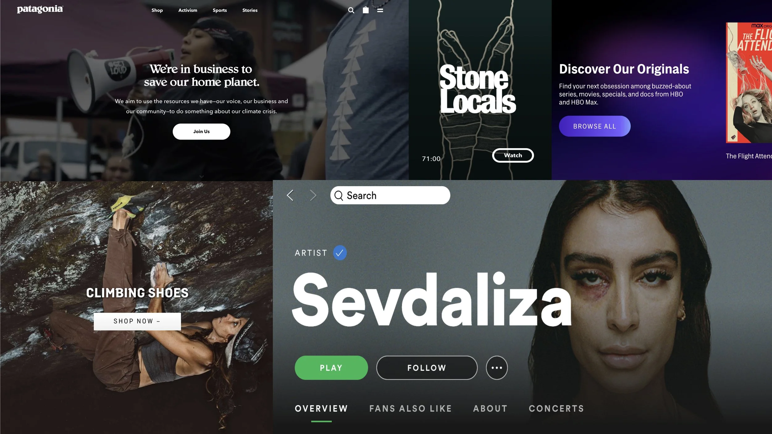
I took a lot of inspiration from different outdoor based companies and especially from Spotify (shamelessly). Spotify’s organization for playlists and discovery seem to fit what exactly I wanted and I took a lot of similar approaches to them. However, the reason for taking a lot of inspiration from outdoor companies is to maintain a modern feel of what they are doing currently.
Design Iterations
Solution 1: Pre-boarding: show information before getting into the app.
Showing testimonials and quotes along with numbers….
User Interface Inspirations
I took a lot of inspiration from different outdoor based companies and especially from Spotify (shamelessly). Spotify’s organization for playlists and discovery seem to fit what exactly I wanted and I took a lot of similar approaches to them. However, the reason for taking a lot of inspiration from outdoor companies is to maintain a modern feel of what they are doing currently.
Solution 2: Post-boarding: Show the features of the application
This should evoke the sense of competition. Bright colors that feel powerful, energetic, and hyped. I wanted to match the feeling of training, you would want to feel like a beast and you’re training to become beastly at climbing.
User Interface Inspirations
I took a lot of inspiration from different outdoor based companies and especially from Spotify (shamelessly). Spotify’s organization for playlists and discovery seem to fit what exactly I wanted and I took a lot of similar approaches to them. However, the reason for taking a lot of inspiration from outdoor companies is to maintain a modern feel of what they are doing currently.
The Final Designs
Refined Concepts to Final Deliverables
These are the landing pages of the two new redesigned sections of the application. At the end, it came out more modern and less confusing to engage with.
Journal Entries
Users will be able to compare and view their spending habits throughout the month. The user will be able to select a button that will allow them to start investing
Surveys & other tools
Individuals will have the opportunity to select a button to locate them to a page that will automate the process of distributing their deposit of money into three categories of needs, wants and savings.
Graph to Visualize Progress
Individuals will have the opportunity to select a button to locate them to a page that will automate the process of distributing their deposit of money into three categories of needs, wants and savings.
Set up reminders and meetings with your advisor
Individuals will have the opportunity to select a button to locate them to a page that will automate the process of distributing their deposit of money into three categories of needs, wants and savings.
Conclusion
This project highlighted key areas for professional growth, particularly in design-to-development communication. I recognized the need to better bridge the gap between design intent and technical implementation, leading me to explore enhanced prototyping methods and video documentation as communication tools.
I also developed stronger problem-solving skills when facing design challenges. When initially struggling with complex concepts, seeking input from developers not only provided technical insights but significantly boosted my confidence in the design process. This experience reinforced the value of cross-functional collaboration and taught me to leverage team expertise when navigating uncertainty.